 Build with Etherly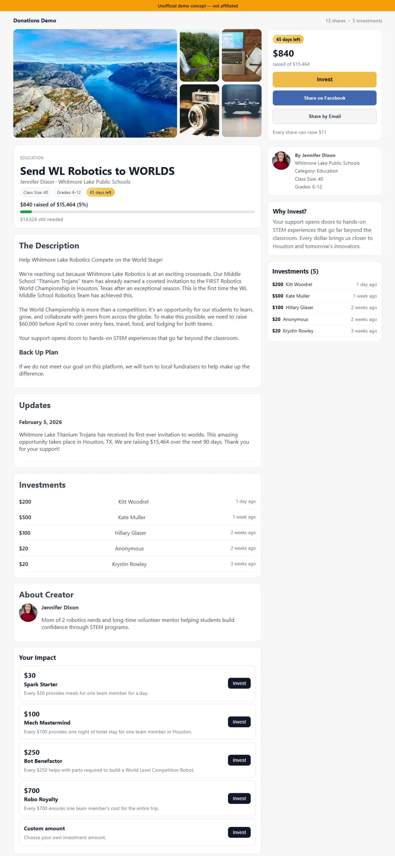
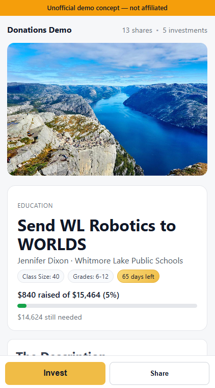
- Built a cause-detail page that organizes the information users actually need before making a donation decision.
- Focused on layout, trust, and CTA clarity rather than decorative design.
- Used a familiar marketplace pattern to reduce friction and make the path to action more obvious.
- Outcome: a stronger, cleaner conversion flow that demonstrates product taste and decision-focused UX.
Independent prototype created for outreach and concept exploration. Not affiliated with the referenced company.